Client: Ravissant (New Delhi, India)
Role: UX/UI Designer
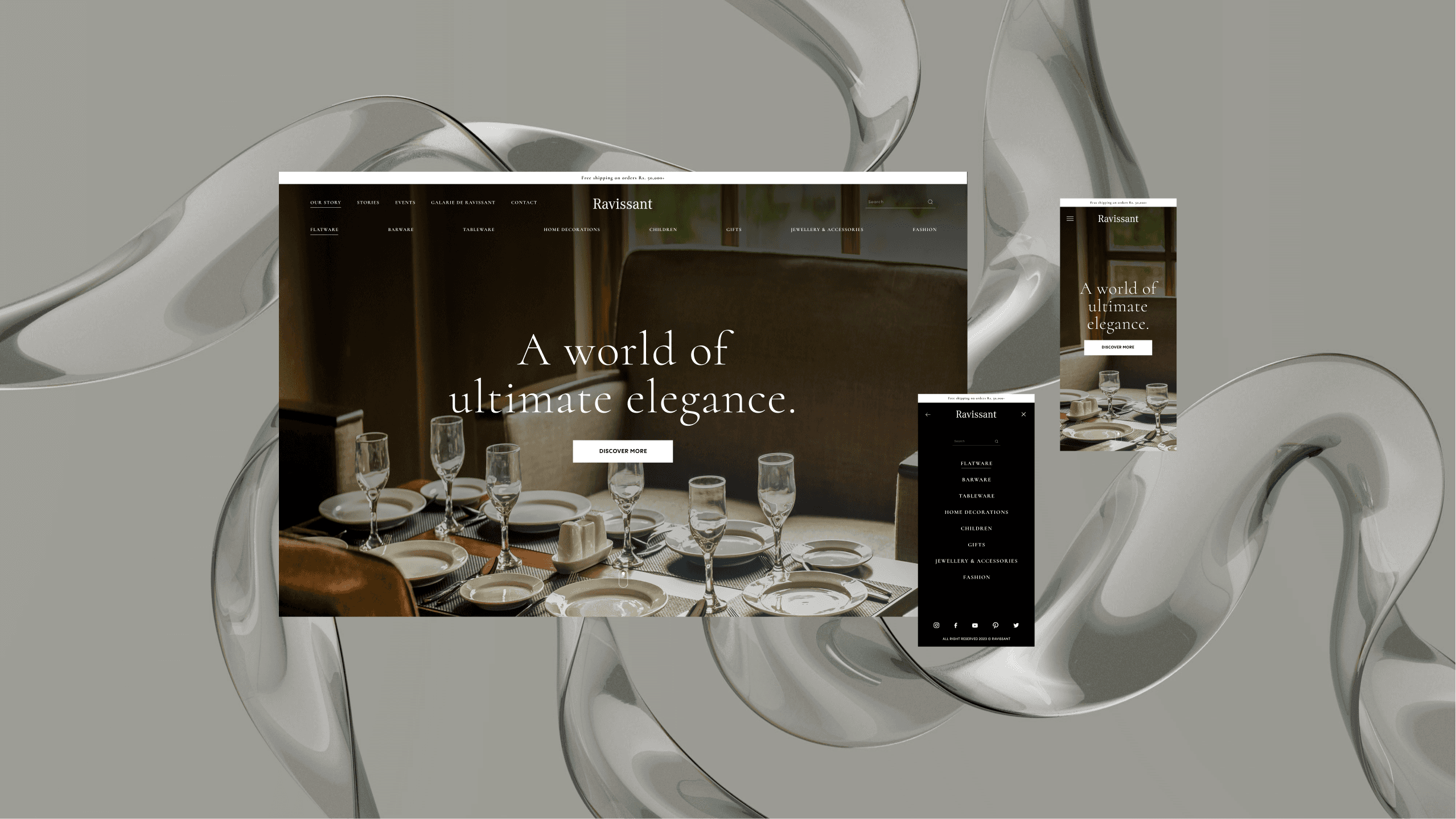
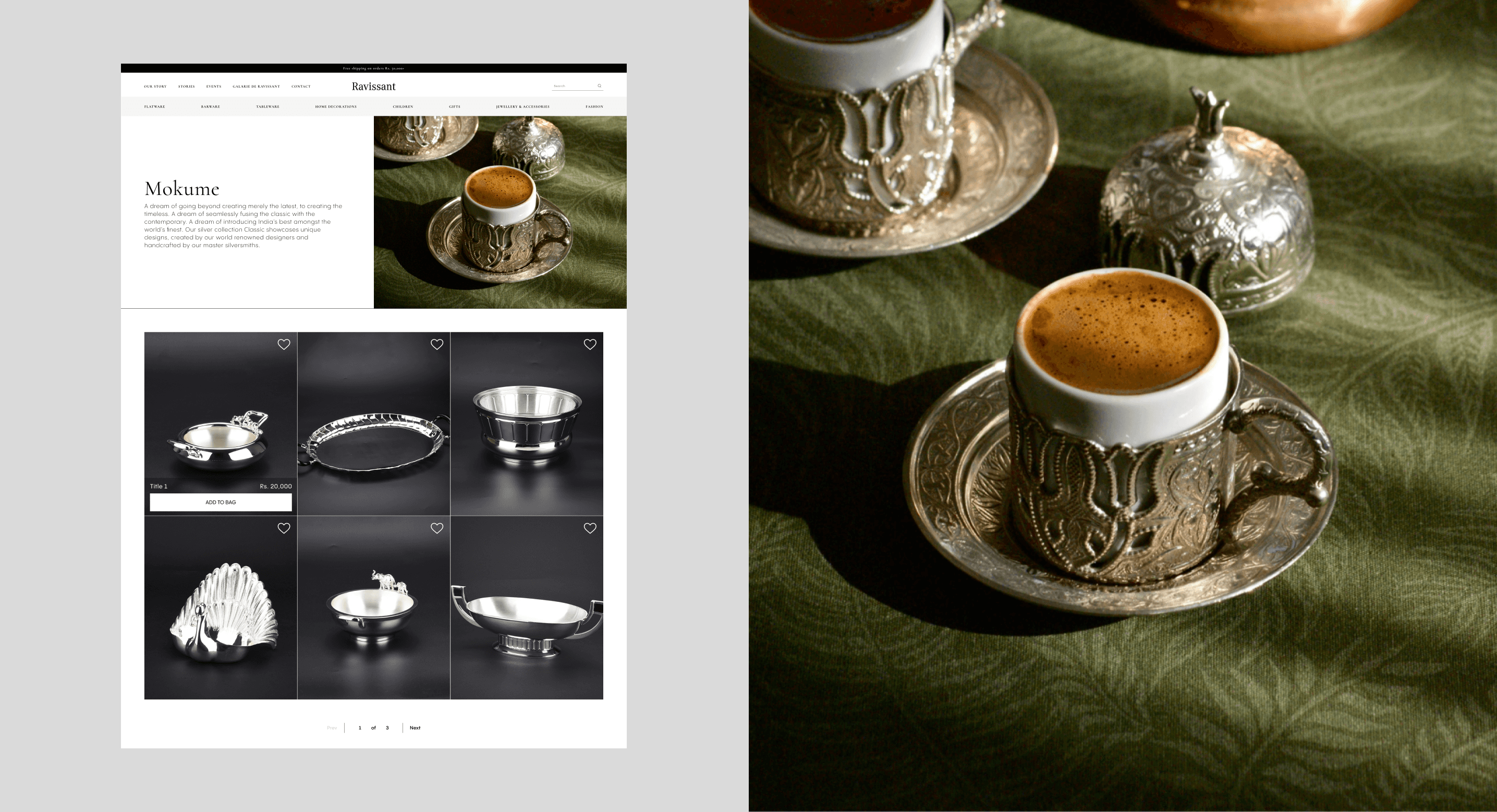
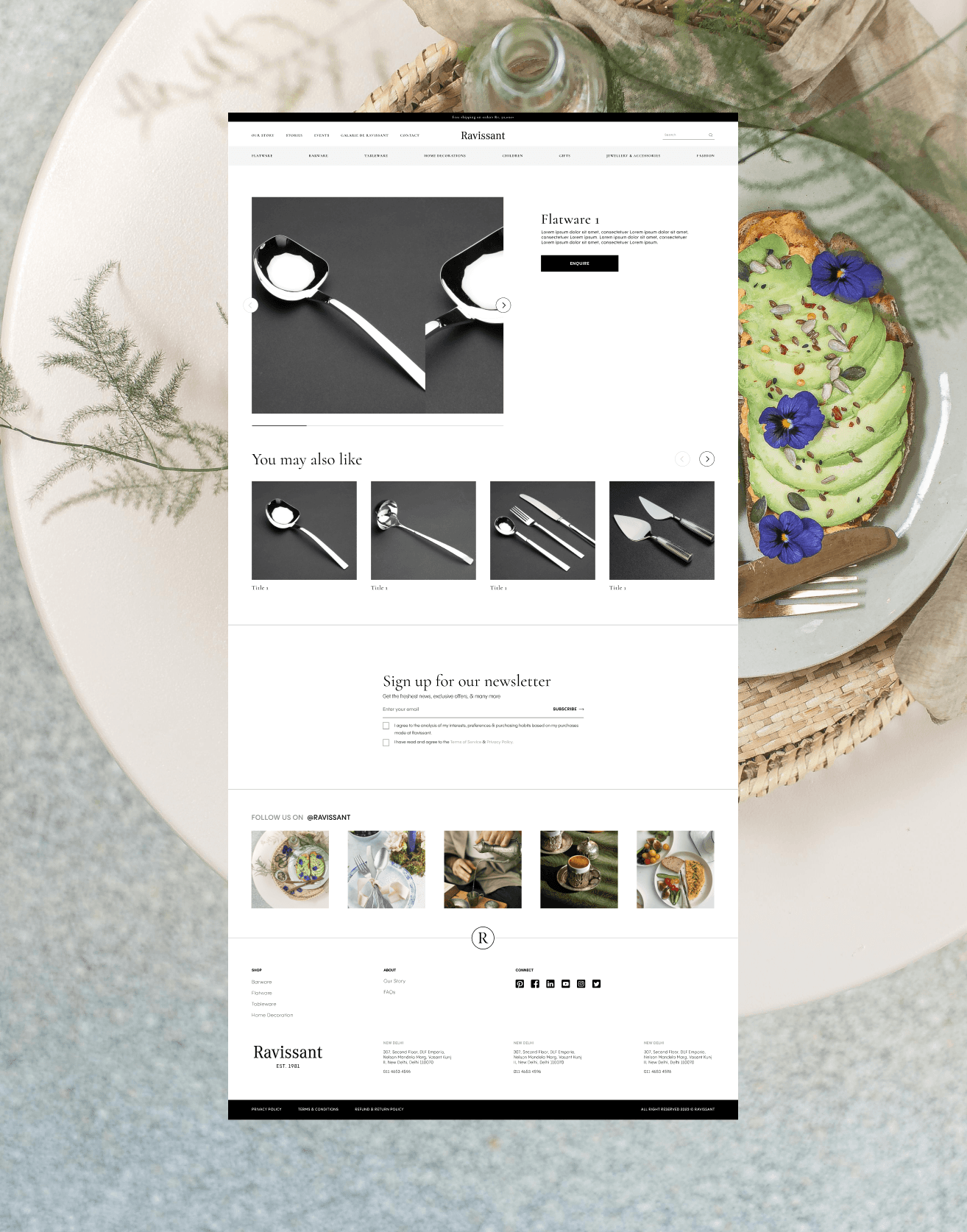
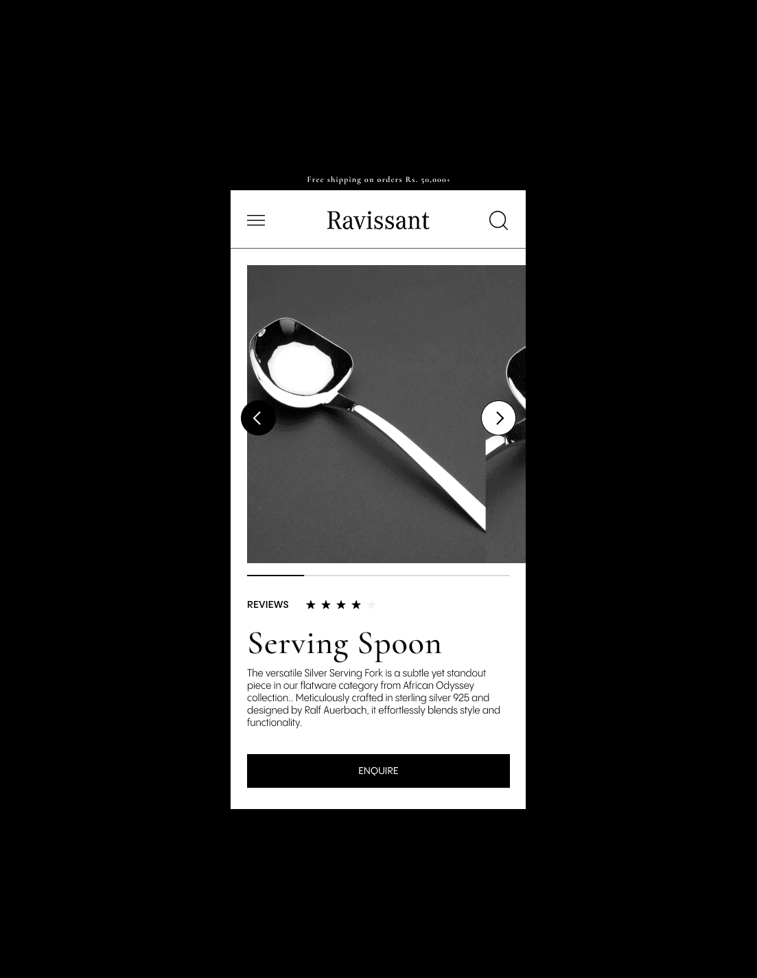
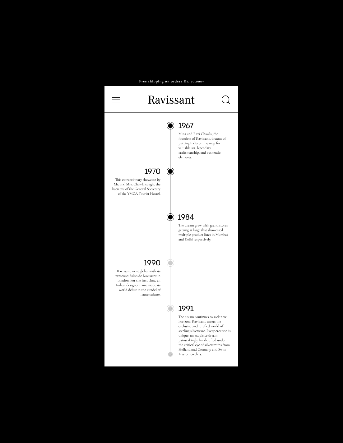
Website Design
Time: 3 weeks
Tools: Figma
Year: 2023

Client Brief

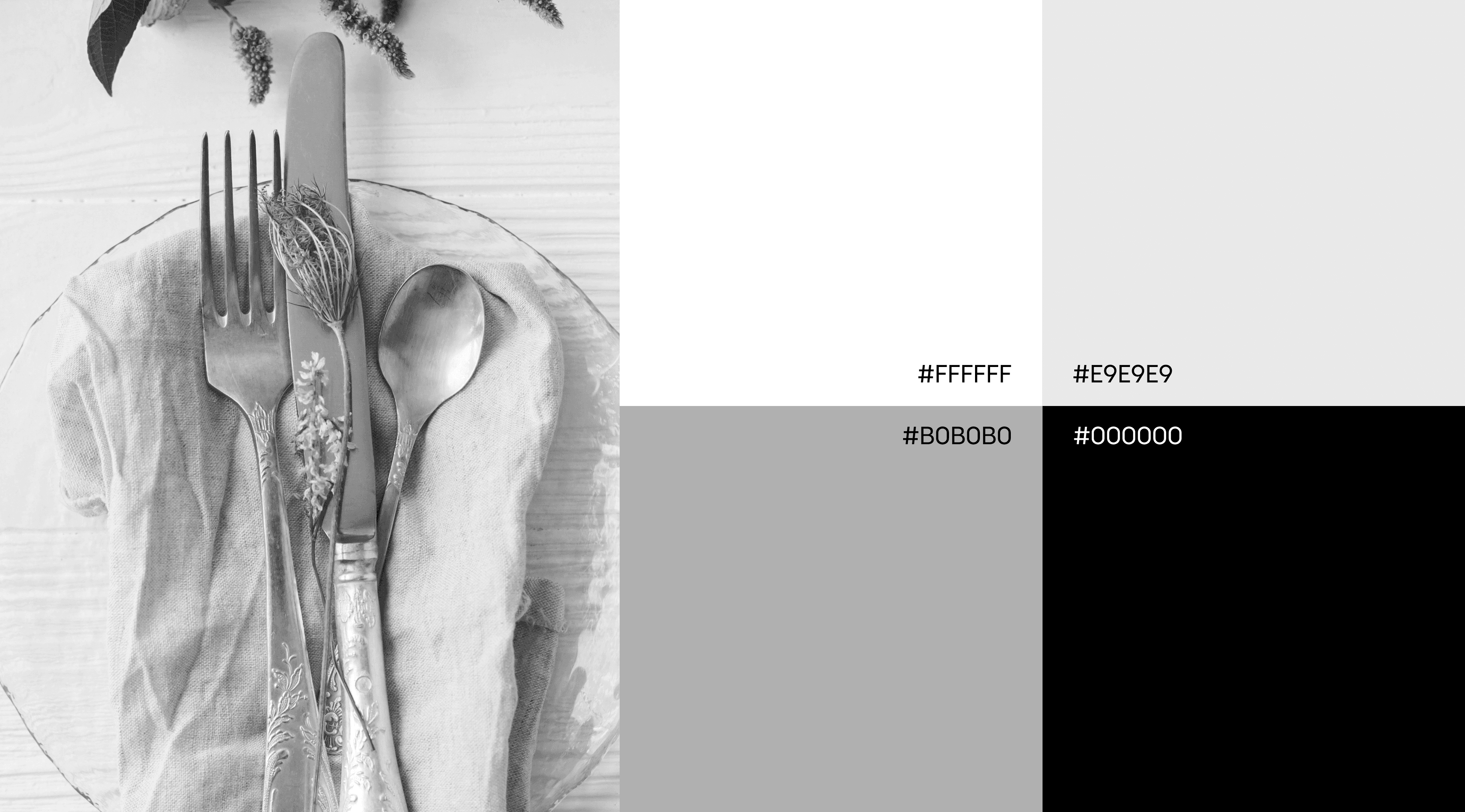
Why this palette ?
I selected a luxury color palette of black, white, and greys for Ravissant's website to emphasize the brand's sophistication and elegance. Here’s why these colors are ideal:
- Black: Pure luxury and sophistication. It’s the perfect backdrop that makes Ravissant’s silverware shine with elegance and exclusivity.
- White: Clean, simple, and refined. It contrasts beautifully with black, keeping the focus on the silverware and giving the design a modern, airy feel.
- Greys: Add depth and balance between black and white. They bring subtlety and sophistication, enhancing the overall refined look.
This combination of colors ensures that the website conveys a high-end, polished look that aligns perfectly with Ravissant’s luxury brand identity, while also creating an elegant and visually engaging user experience.
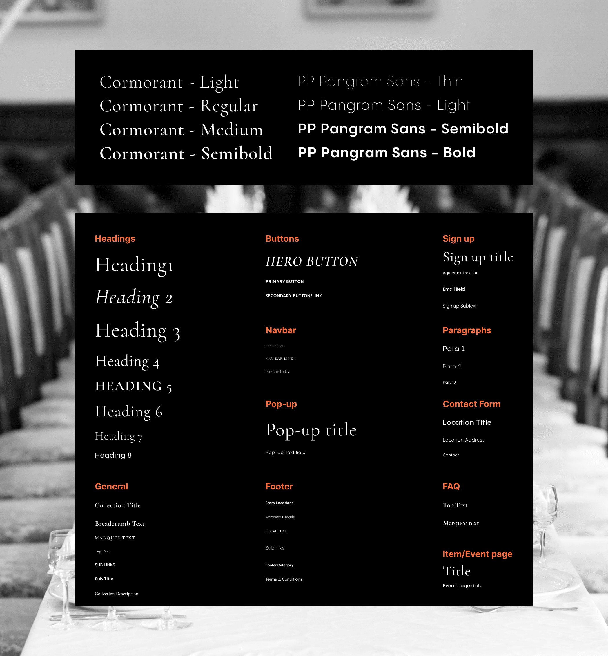
Font Selection
I selected the Cormorant family and PP Pangram Sans for Ravissant’s website to enhance the brand's luxury and modernity:
- Cormorant Family: A serif font with a timeless elegance, perfect for Ravissant. It brings luxury and sophistication to headings and key text, offering a variety of styles for a refined look.
- PP Pangram Sans: A modern, minimalistic sans-serif that complements Cormorant’s classic elegance. It’s clean and highly readable, ideal for body text and UI elements, adding a contemporary touch to the overall design.
By combining these two fonts, the website will convey a sense of timeless elegance while maintaining a fresh, contemporary feel, perfectly aligning with Ravissant’s brand identity.


Takeaways