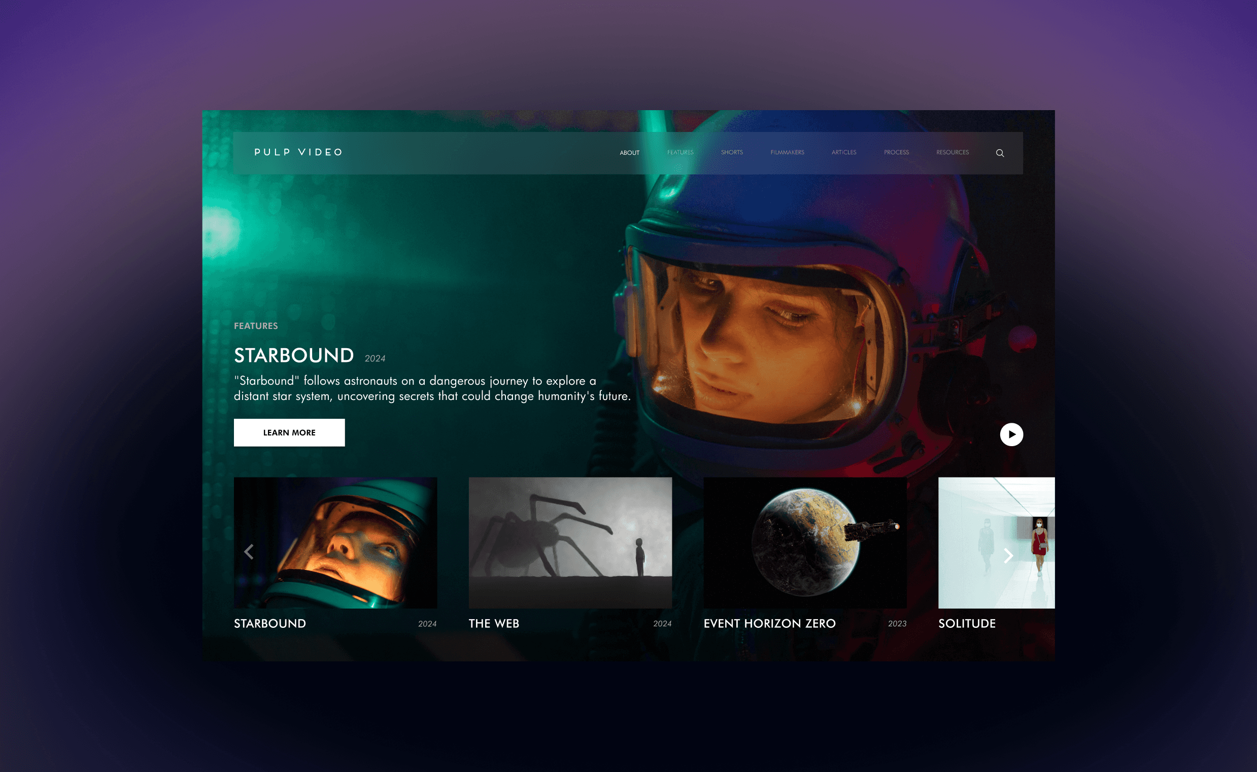
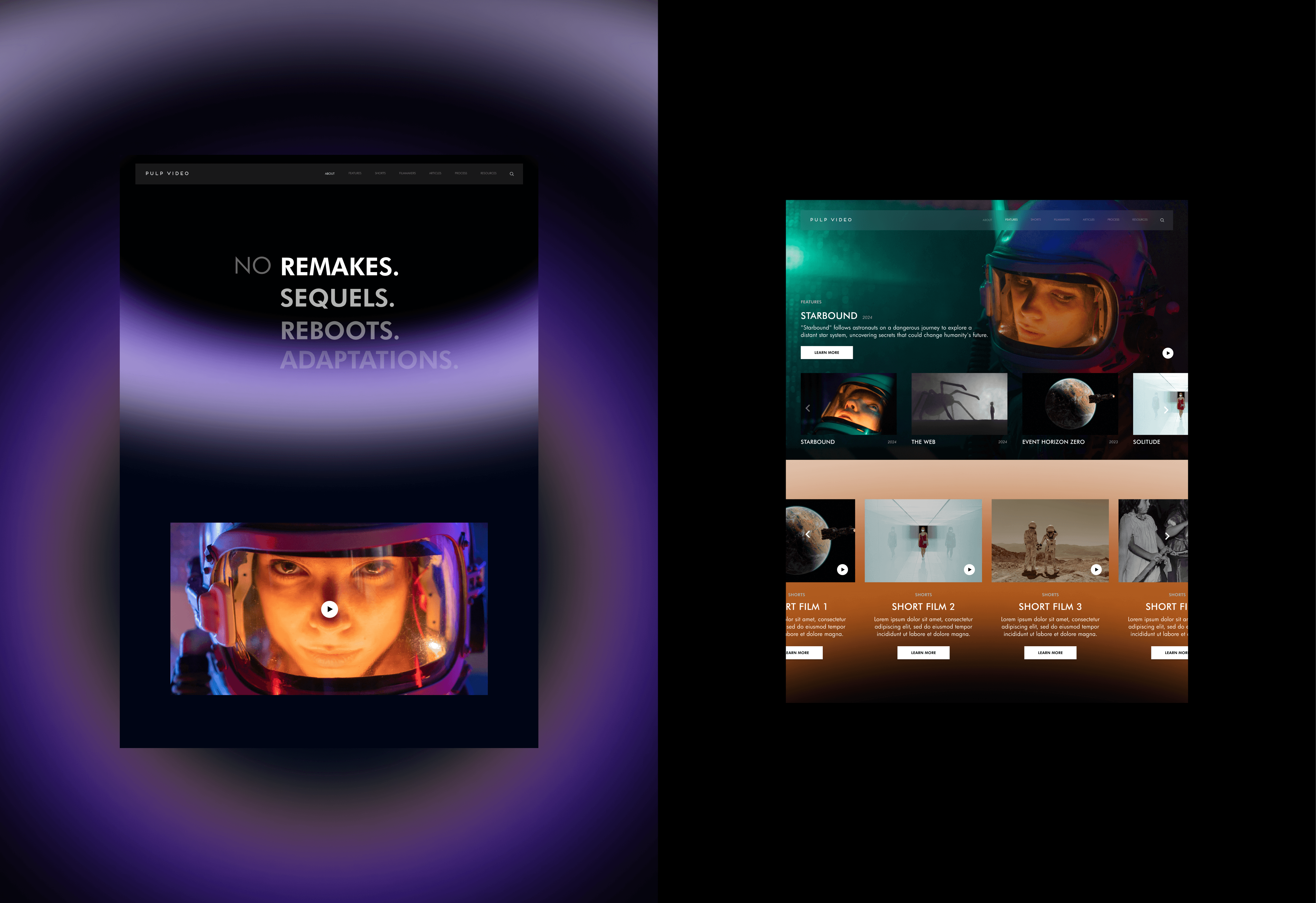
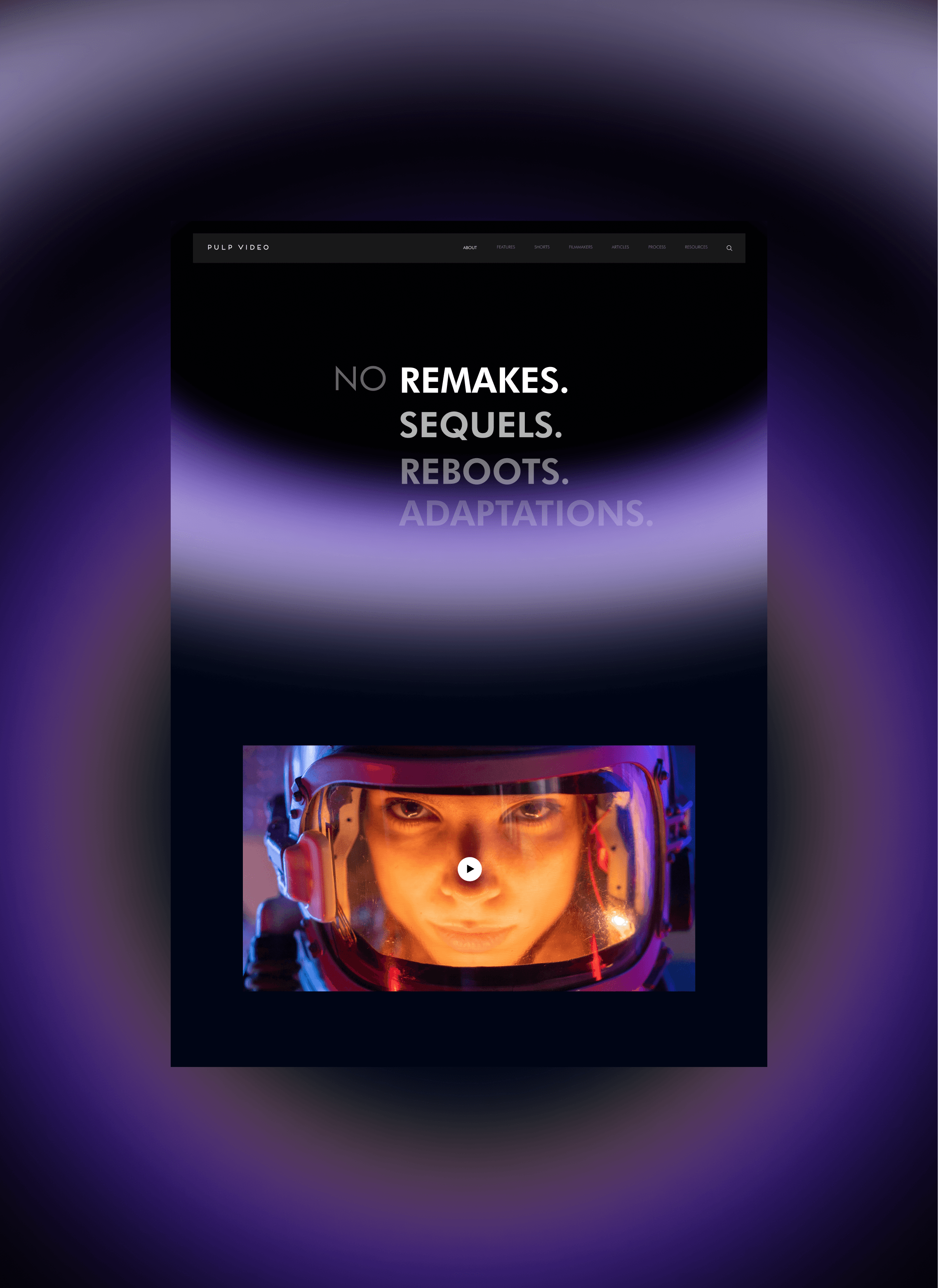
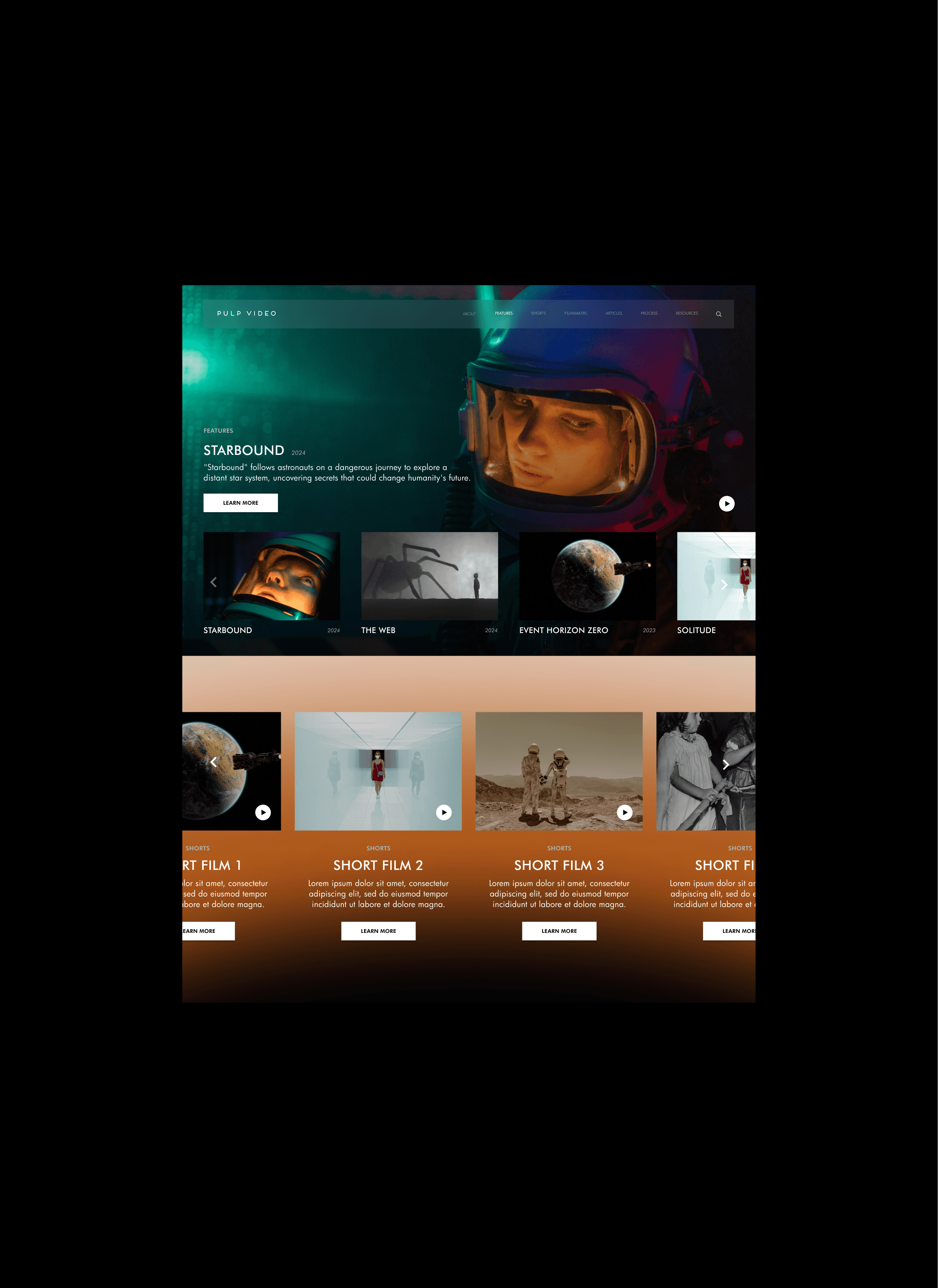
I designed the Pulp Video website to align with its mission of fostering originality in filmmaking. Drawing inspiration from horror, sci-fi, and fantasy genres, the design features a mysterious color palette, dynamic visuals, and a clean layout that highlights films and behind-the-scenes content.
Focusing on user experience, I ensured intuitive navigation, accessible submission tools, and engaging showcases, creating a platform that celebrates creativity and inspires filmmakers to share their unique visions.
Website Design
Time: 4 weeks
Year: 2024
Pulp Video aims to foster original filmmaking by providing a platform for filmmakers to showcase original movies, with an emphasis on genres of horror, science
fiction, and fantasy. The initiative stems from the need for more original content in an
industry saturated with films based on existing intellectual properties.
The core values of Pulp Video is originality and transparency. The platform aims to inspire filmmakers to create and share their unique visions while providing behind-the-scenes insights into their creative processes.
Goal: To create a website design that cultivates a vibrant community of original filmmakers and to champion the production of more unique movies, and to pave the way for more original movies to be made.
Step 1.
Palette Overview
For Pulp Video’s website, I’ve chosen a color palette that to reflects the mysterious and imaginative essence of the brand. Colors like dark purple, black, and a tinge of orange evoke the essence of the horror, science fiction, and fantasy genres. Here's why:
Dark Purple: Represents creativity and mystery, perfectly capturing the imaginative essence of horror, sci-fi, and fantasy.
Black: Adds depth, intensity, and drama, reflecting the darker tones central to these genres.
Tinge of Orange: Introduces contrast and energy, symbolizing curiosity and innovation while breaking the monotony of dark shades.


Step 3.
Layout and Wireframing
Created Wireframes: I developed low-fidelity wireframes to map out the website's structure and layout, focusing on how users would interact with the content. I ensured that the user flow was intuitive and that content placement made sense.
Decided on Grid System: I chose a grid system that would guide the layout, ensuring consistency and alignment across all pages. This provided a strong foundation for the design's structure.
Design Components
Designed UI Elements: I started designing buttons, forms, icons, and other interactive elements, making sure they were consistent with the overall design language and color palette.
Created Reusable Components: To maintain consistency and efficiency, I developed a library of reusable components, such as buttons, navigation bars, and cards, which could be easily applied throughout the design process.
Created Product Mockups: For the time being, I also designed product mockups, allowing the client to visualize potential products and how they would fit into the overall brand aesthetic. These mockups served as placeholders until the actual products were finalized.
High-Fidelity Mockups
Developed Mockups: I turned the wireframes into high-fidelity mockups, applying the chosen color palette, typography, and UI elements. This stage was all about refining the details to ensure the design was not only visually appealing but also functional.
Prototyped Key Interactions: I created interactive prototypes to demonstrate how users would interact with the design. This helped me visualize animations, transitions, and the overall user experience, making sure everything flowed smoothly.
This approach allowed me to maintain a cohesive, user-centered design process, ensuring that every detail contributed to a seamless and engaging user experience.
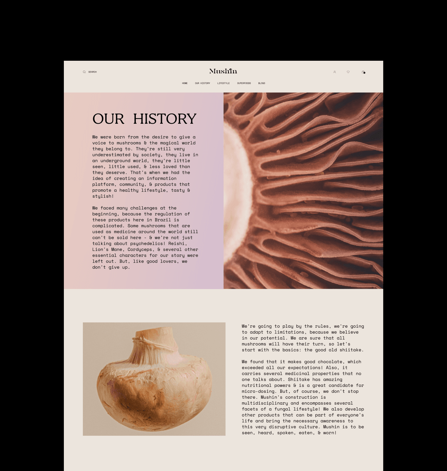
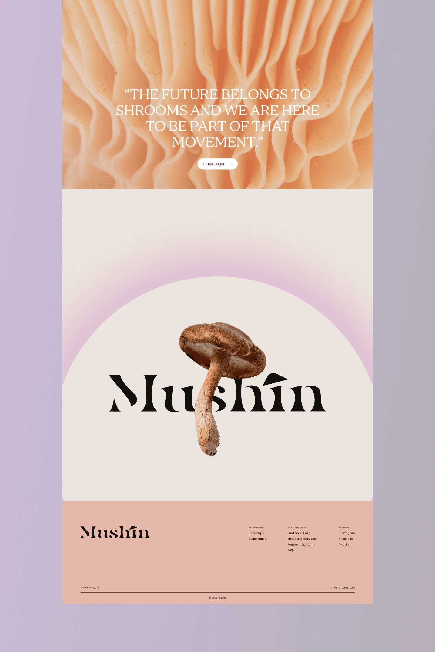
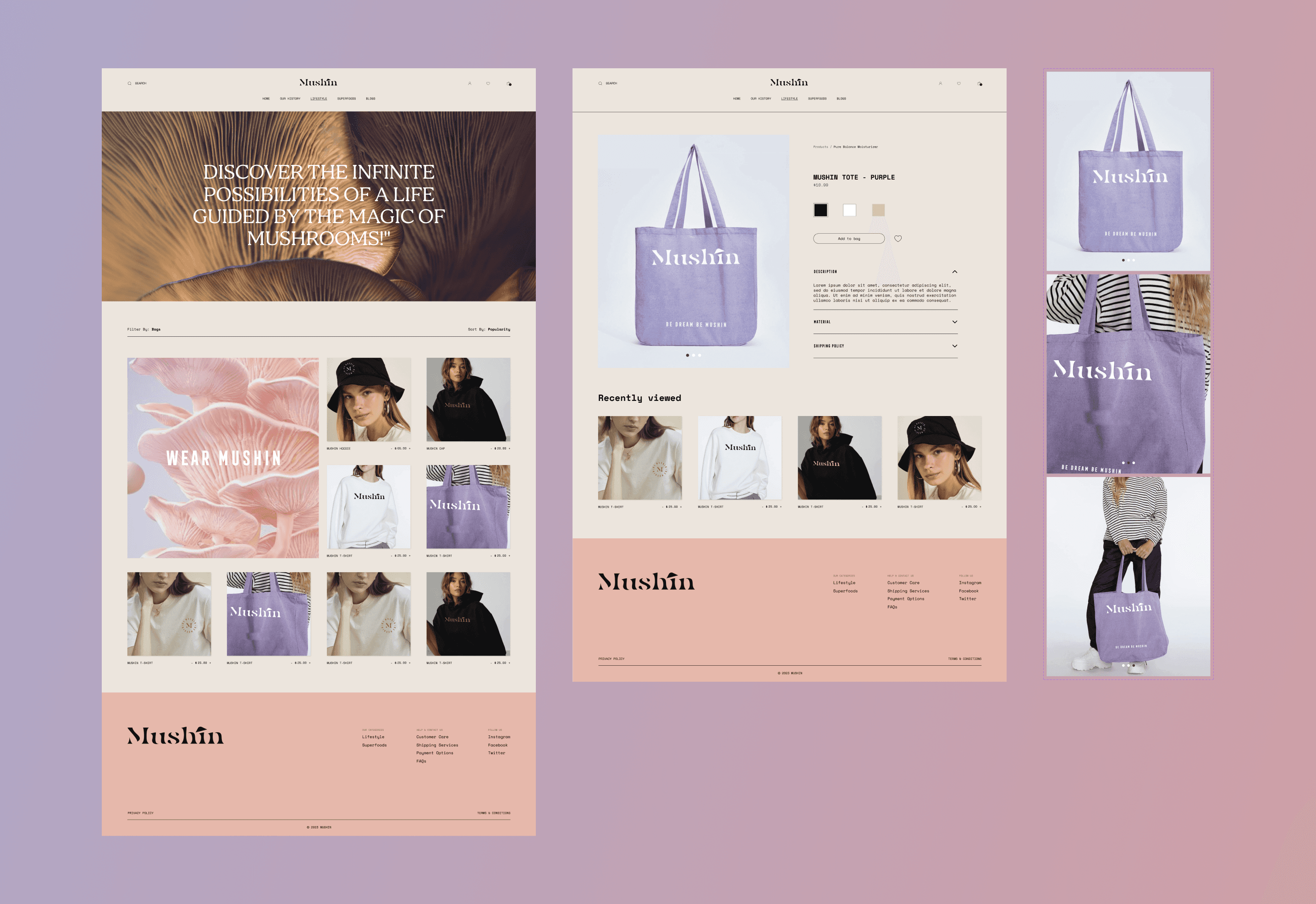
Below are some more snippets from the project and how I used by creative thinking into designing Mushin's e-commerce platform.


Takeaways
Explored e-commerce design fundamentals to make the site visually appealing and user-friendly.
Prepared the site for future product integration with a smooth, functional user flow.
Adapted design inspiration from similar brands while maintaining Mushin’s unique identity.
Focused on storytelling through design to align with Mushin’s ethos, despite no product launch.
Used typography (Bogus, Space Mono) and pastel colors to create a dreamy, wellness-focused aesthetic.