
Brand/Content Strategy
Website Design
Time: 1 week
Year: 2023


Step 1.
Palette Overview
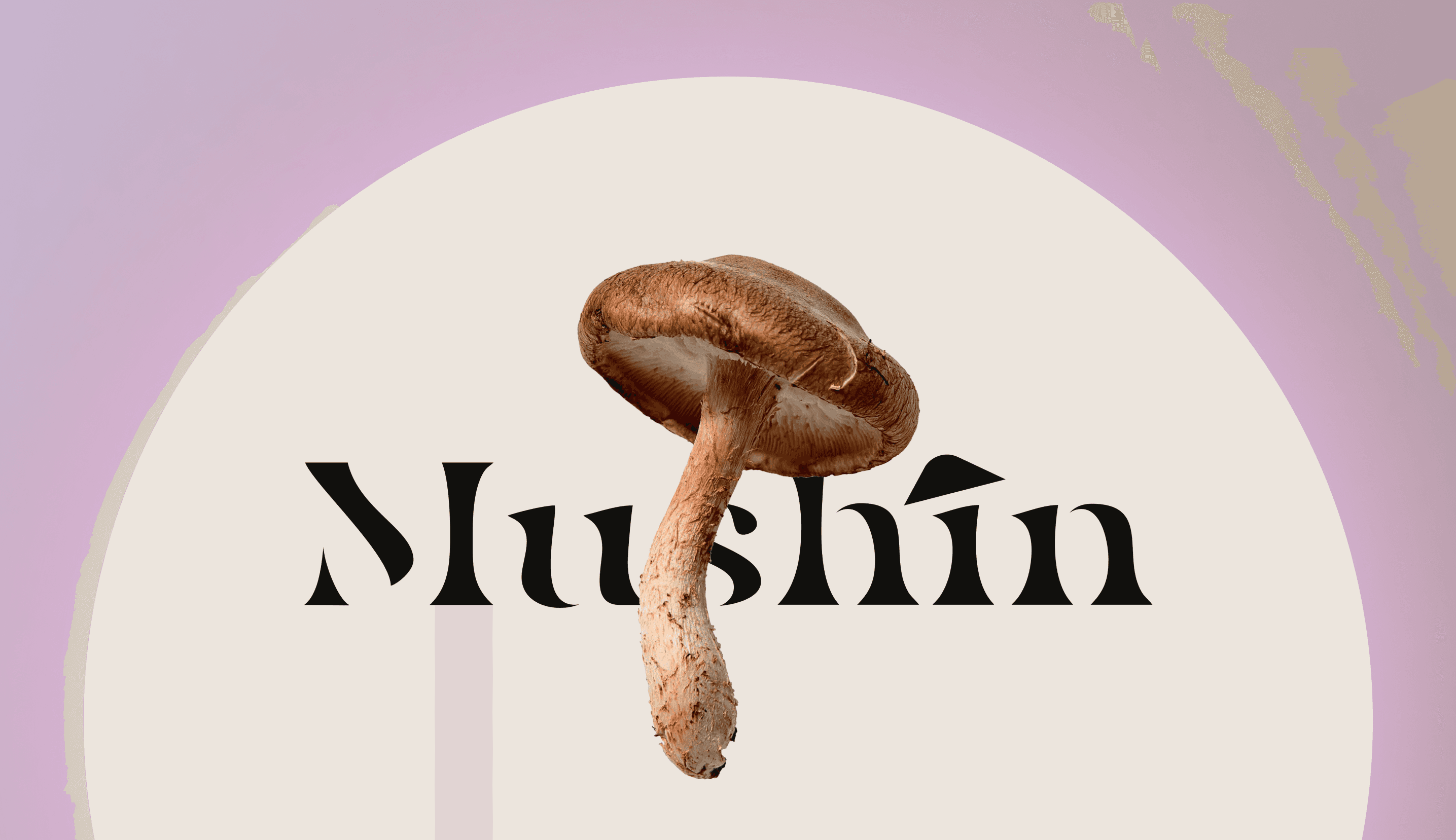
For Mushin’s website, I’ve chosen a color palette that exudes a whimsical and dreamy atmosphere, perfectly aligned with the brand’s focus on wellness and the natural benefits of mushrooms. The palette is a delicate blend of soft pastels and earthy neutrals, creating a tranquil, inviting space for users.
Color Choices
Base Colors:
Soft Beige (#ECE5DD): A warm, neutral tone inspired by the natural hues of mushrooms, adding an organic, grounding touch.
Muted Lavender (#CCBBD6): Brings calmness and serenity, perfect for a wellness-focused, dreamy vibe.
Accent Colors:
Pale Peach (#E6B8AB): Adds subtle warmth and a soft, inviting glow without overpowering the palette.
Dusty Rose (#E6C2CF): Introduces a romantic touch, ideal for highlighting key elements while keeping the dreamy aesthetic.
Supporting Colors:
Light Gray (#EAEAEA): Balances the palette with subtle contrast, keeping the design elements prominent.
Black (#000000): Adds depth and contrast, making key elements pop while maintaining sophistication.
White (#FFFFFF): Enhances space and lightness, ensuring the design feels airy, clean, and easy to navigate.

- Dreamy Vibes: Soft pastels like lavender and peach, combined with earthy neutrals, create a serene, dreamlike feel that reflects the brand's ethos.
- Whimsical Feel: Playful yet calming colors add a whimsical touch, making the website feel inviting and unique.
- Natural Connection: Earthy tones ground the design, reflecting natural ingredients, while pastels bring lightness and calm.
- Balanced Contrast: Muted tones keep the palette harmonious, with just enough contrast to guide the user experience smoothly.


Step 2.
Font Selection
Bogus: Playful and whimsical, Bogus adds a unique, slightly irregular design that complements the dreamy, organic feel of the Mushin brand, making the website approachable and engaging. Its distinctive style adds personality to key elements, reinforcing the brand's identity.
Space Mono: A modern, geometric monospaced font, Space Mono provides strong contrast to Bogus. Its clean design ensures excellent readability, grounding the whimsical aspects with structure and order.
Why They Work Together?
The pairing strikes a balance between playful and structured, enhancing the visual experience while building a memorable, cohesive brand identity focused on wellness, creativity, and nature.


Step 3.
Layout and Wireframing
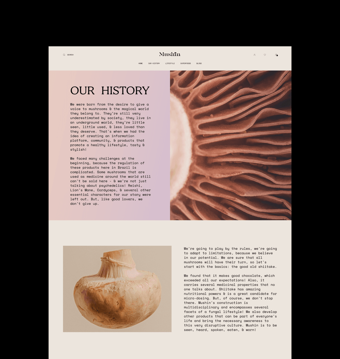
Created Wireframes: I developed low-fidelity wireframes to map out the website's structure and layout, focusing on how users would interact with the content. I ensured that the user flow was intuitive and that content placement made sense.
Decided on Grid System: I chose a grid system that would guide the layout, ensuring consistency and alignment across all pages. This provided a strong foundation for the design's structure.
Design Components
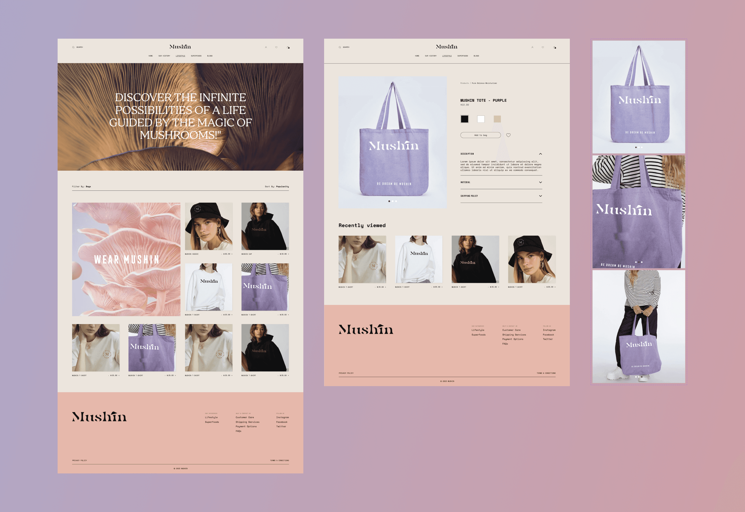
Designed UI Elements: I started designing buttons, forms, icons, and other interactive elements, making sure they were consistent with the overall design language and color palette.
Created Reusable Components: To maintain consistency and efficiency, I developed a library of reusable components, such as buttons, navigation bars, and cards, which could be easily applied throughout the design process.
Created Product Mockups: For the time being, I also designed product mockups, allowing the client to visualize potential products and how they would fit into the overall brand aesthetic. These mockups served as placeholders until the actual products were finalized.
High-Fidelity Mockups
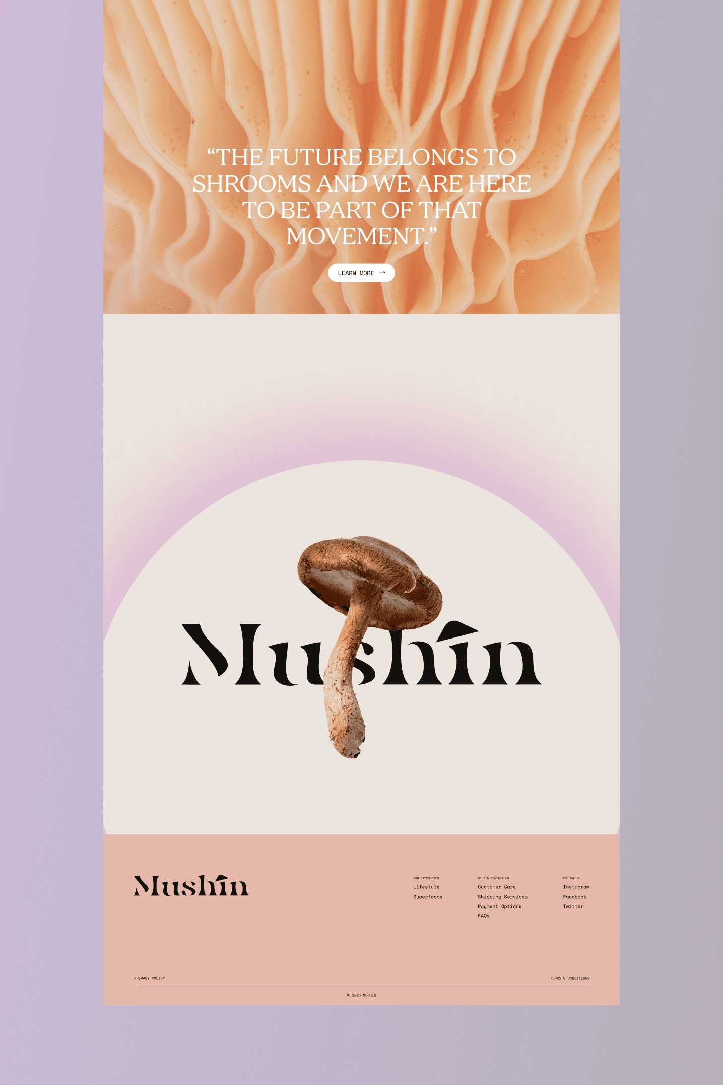
Developed Mockups: I turned the wireframes into high-fidelity mockups, applying the chosen color palette, typography, and UI elements. This stage was all about refining the details to ensure the design was not only visually appealing but also functional.
Prototyped Key Interactions: I created interactive prototypes to demonstrate how users would interact with the design. This helped me visualize animations, transitions, and the overall user experience, making sure everything flowed smoothly.
This approach allowed me to maintain a cohesive, user-centered design process, ensuring that every detail contributed to a seamless and engaging user experience.
Below are some more snippets from the project and how I used by creative thinking into designing Mushin's e-commerce platform.


Takeaways
Explored e-commerce design fundamentals to make the site visually appealing and user-friendly.
Prepared the site for future product integration with a smooth, functional user flow.
Adapted design inspiration from similar brands while maintaining Mushin’s unique identity.
Focused on storytelling through design to align with Mushin’s ethos, despite no product launch.
Used typography (Bogus, Space Mono) and pastel colors to create a dreamy, wellness-focused aesthetic.