
Client: Cyan Advisories (India)
Role: UI Designer/Developer
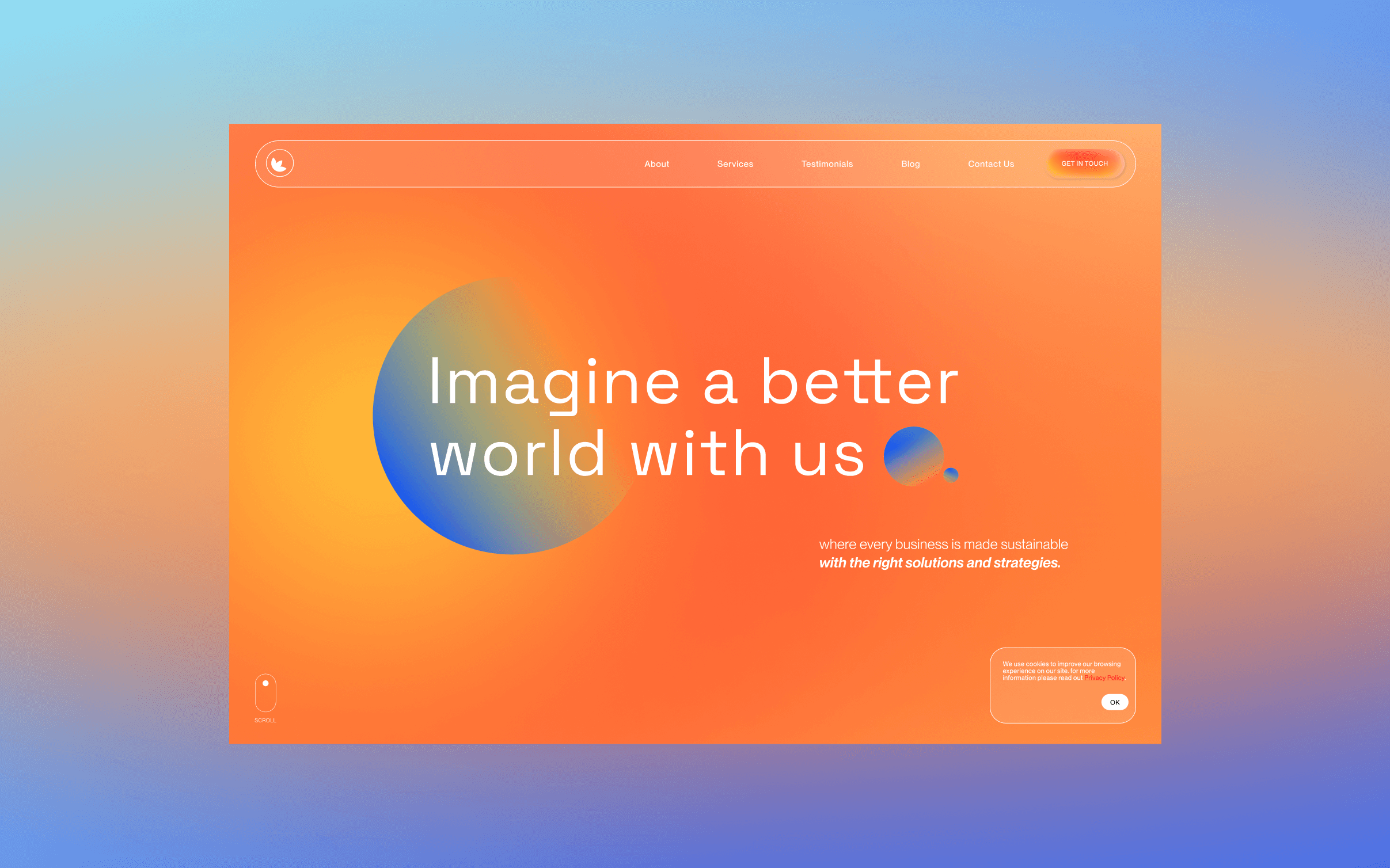
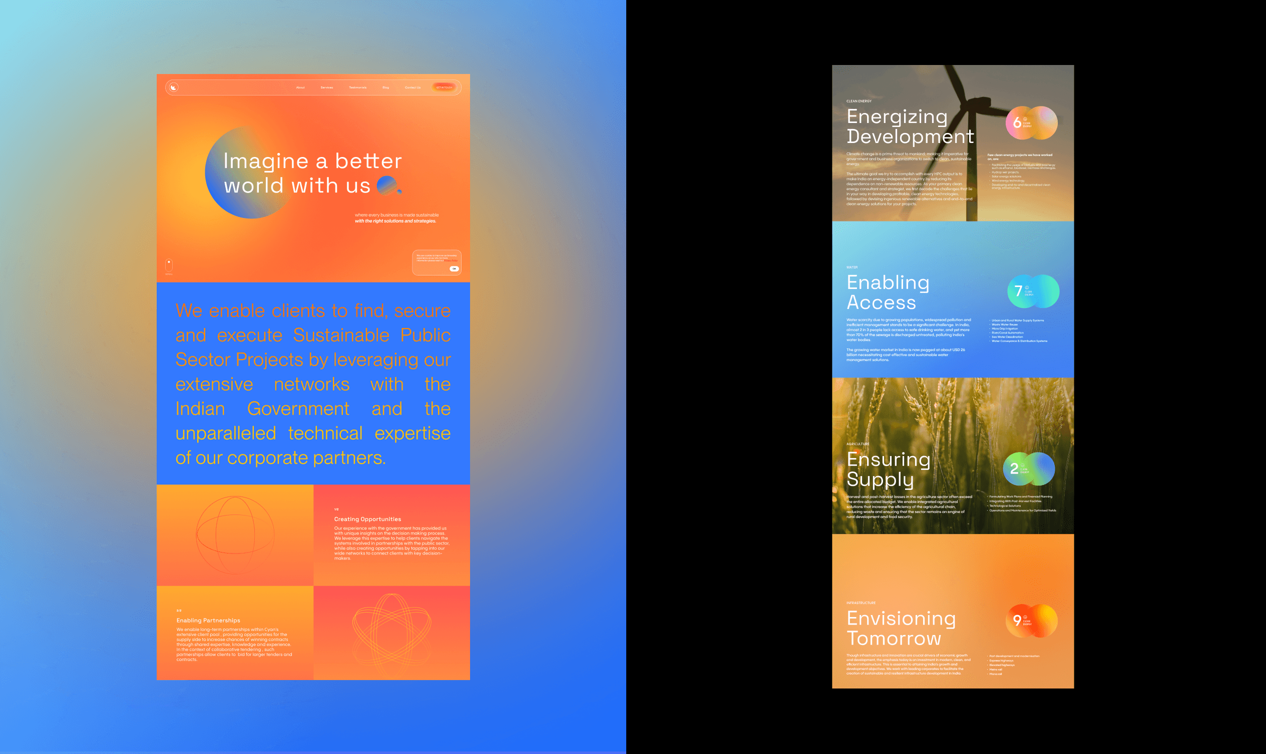
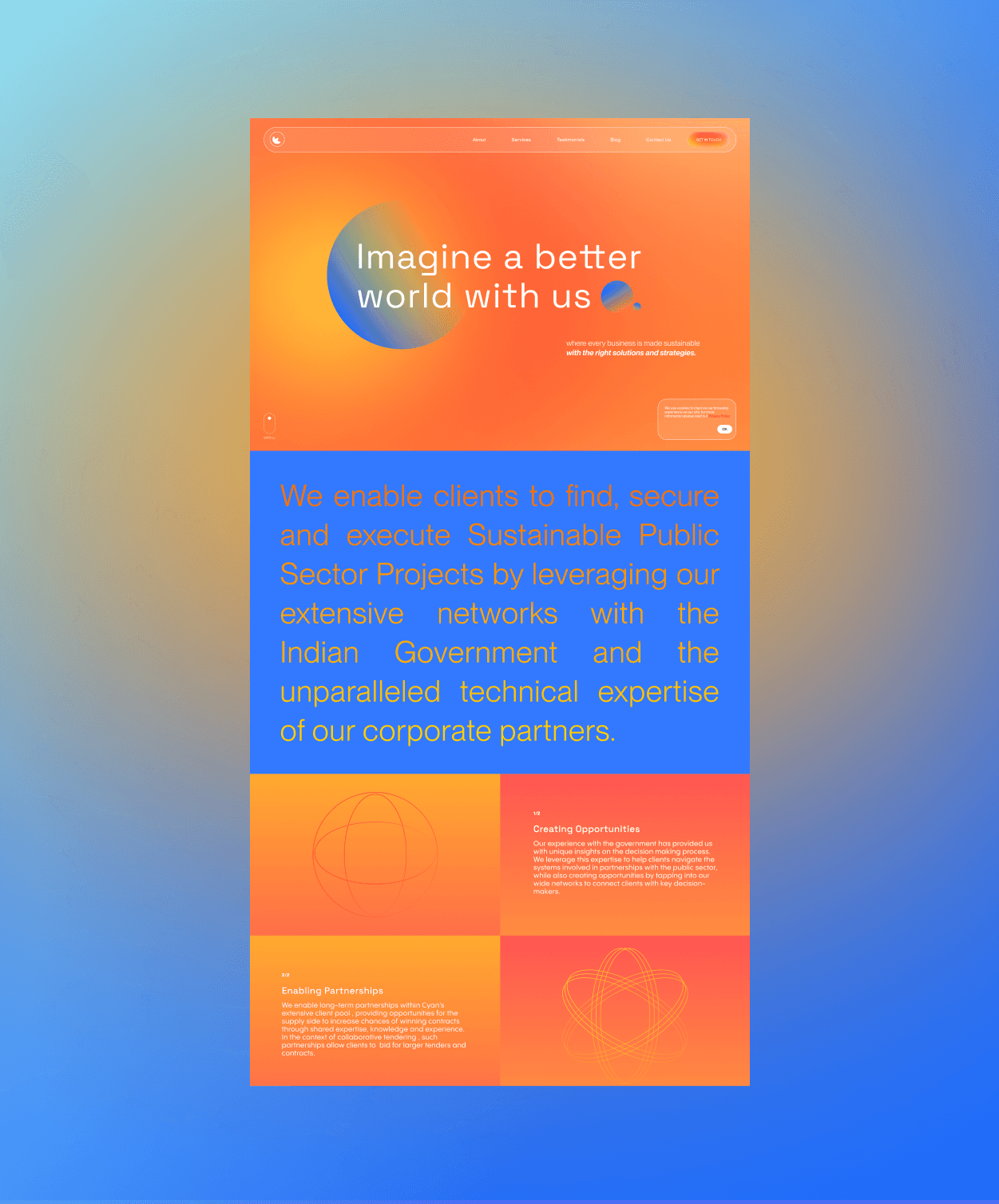
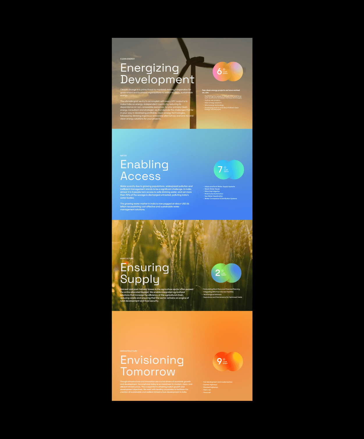
Landing Page Design/Framer Development
Time: 3 week
Tools: Figma
Year: 2024
Step 1.
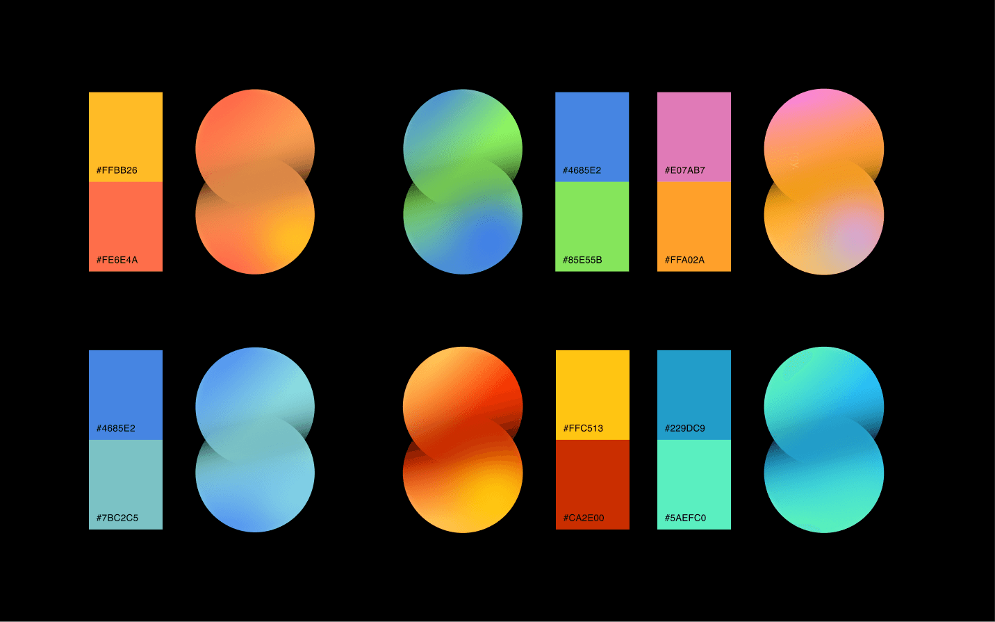
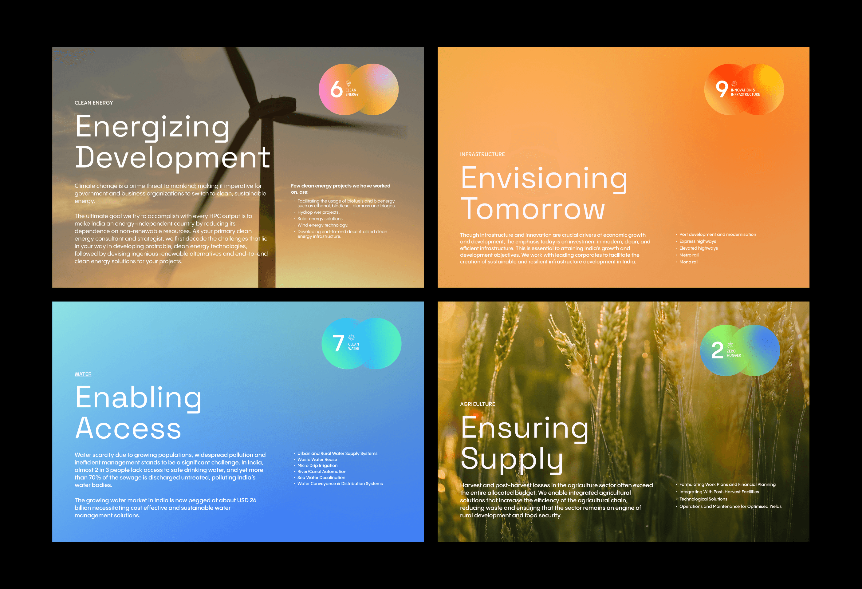
Color Palette
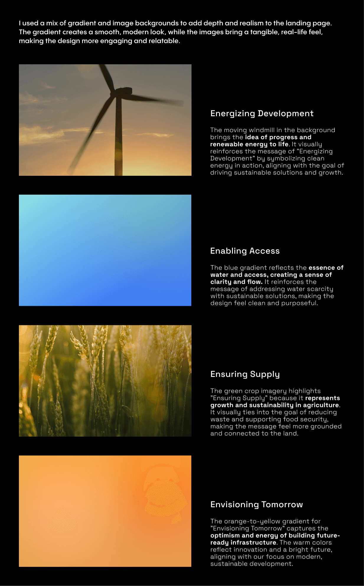
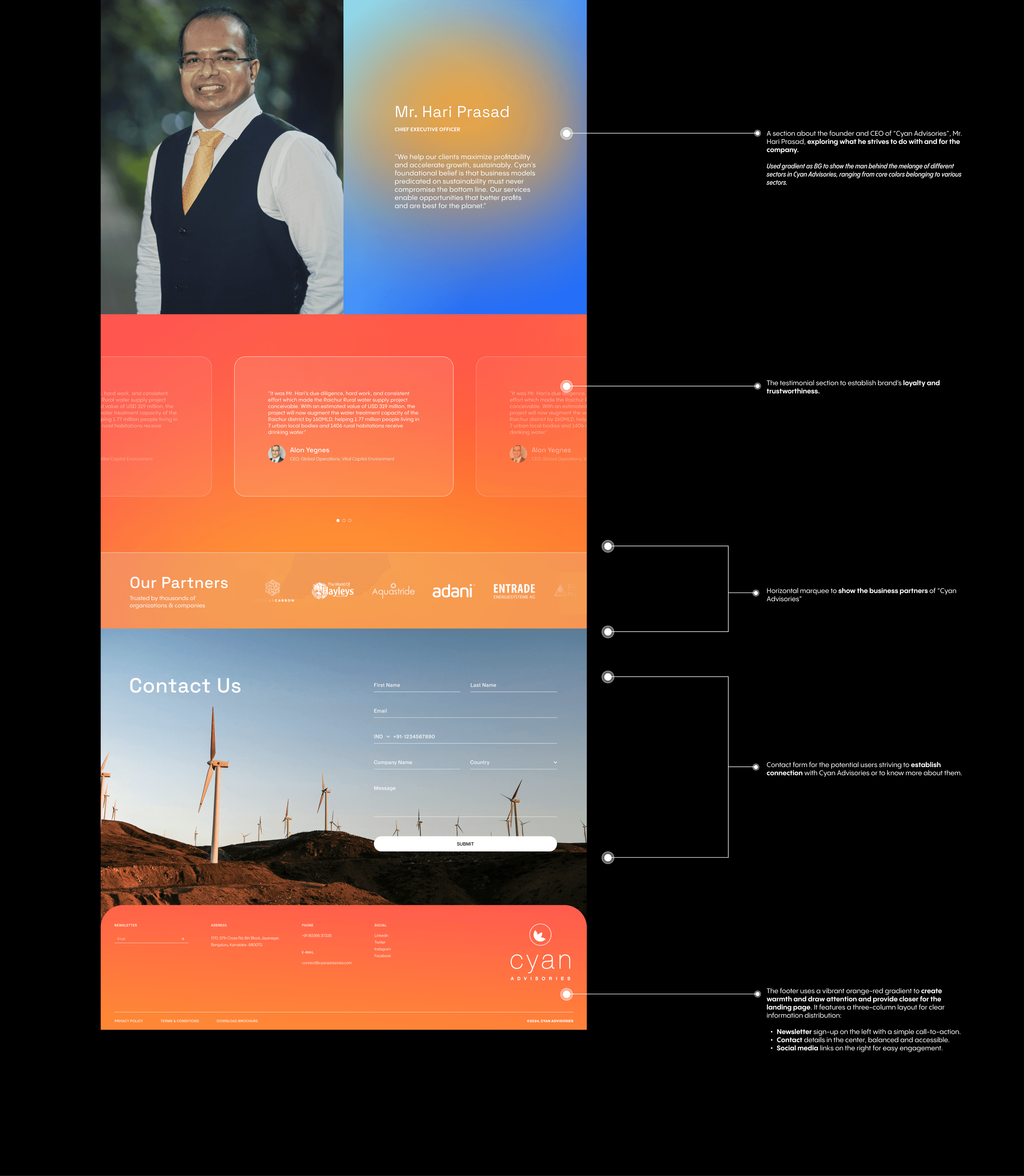
For Cyan Ardvisories, I chose to work with gradients because of the melange of the sectors they are helping with. To emphasized I used the palette with yellow, orange, and blue to reflect the brand’s core values of creating opportunities and enabling partnerships.
Yellow: Optimism and forward-thinking
Orange: Adds warmth and approachability.
Blue: Conveys trust and stability.
Green: For accents, conveys sustenance
Together, these colors create a dynamic, engaging identity that fosters collaboration and growth.

Color Associations

Typefaces

Abstracts

Iconography


Step 2.
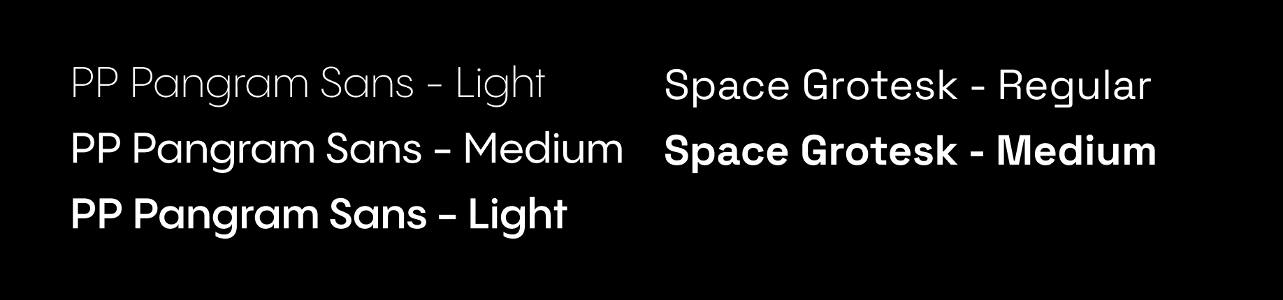
Font Selection
PP Sans Pangram: Offers a clean, contemporary feel, which adds a sleek, approachable touch, aligning with Cyan Advisories' grounded yet forward-thinking ethos.
Space Grotesk: Brings a geometric, structured look, ensuring readability and a sense of precision, reinforcing trust and credibility.
Together, they create a visually engaging yet reliable and professional aesthetic, ideal for Cyan Advisories.


Takeaways
Clear Messaging: Crafting a direct and compelling value proposition via the landing page.
Abstract Shapes: Utilizing abstract shapes to add visual interest and reinforce the brand's identity and message.
Visual Hierarchy: Making content easy to scan and digest for the audiences.
Analytics: Using numbers to summarize the content.
Brand Consistency: Keeping your brand’s look and feel cohesive.
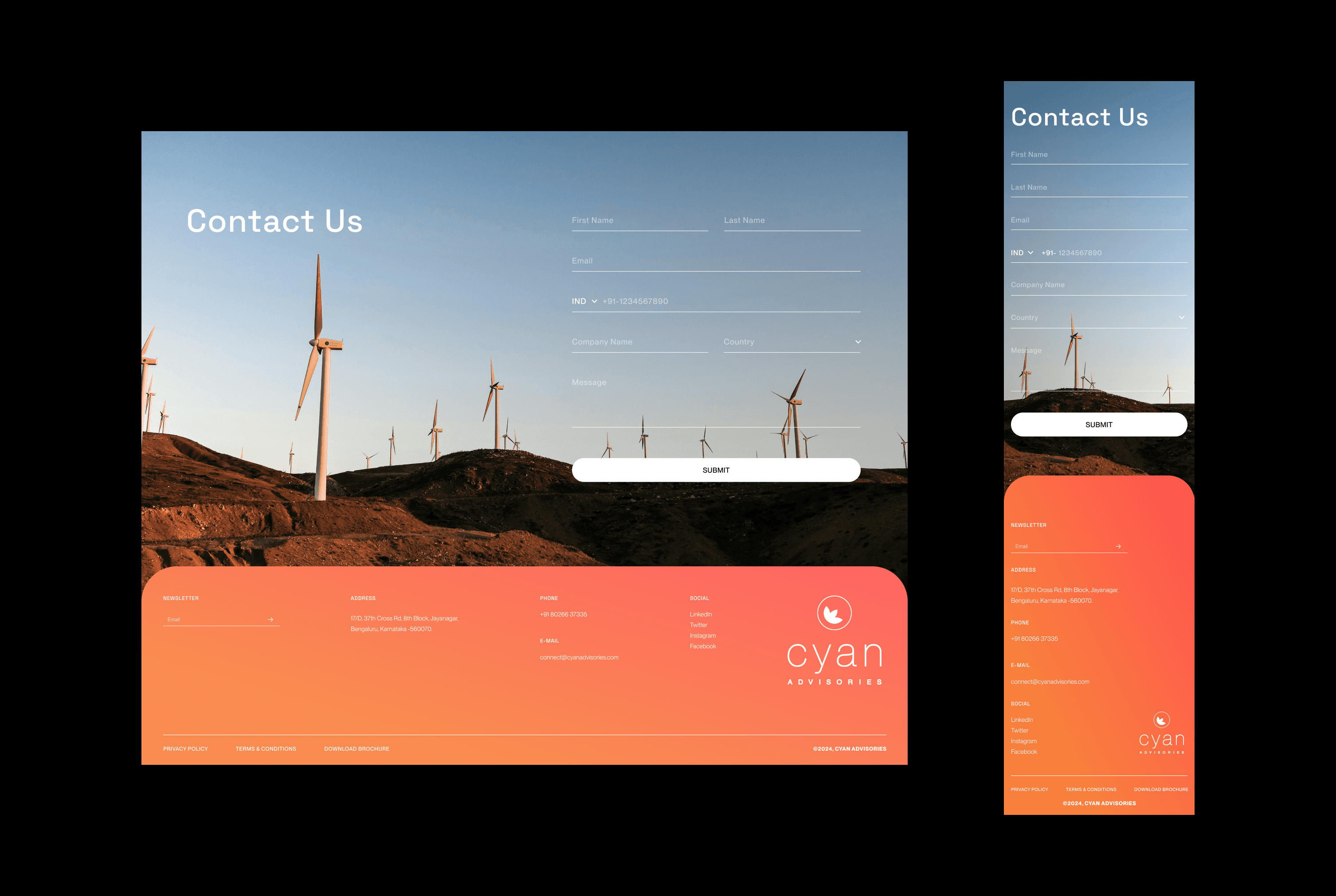
Responsive Design: Ensuring the page looks great on any device.
Engaging Content: Connecting with your audience through relevant content.
For more detailed study checkout Behance.